Just as the sun rises and sets each day, the digital design trends treadmill will never stop rolling. With creativity and a sense of pushing the boundaries of what is possible leading the way right now. At Casper Creative we have taken a closer look at some of the hottest trends of the moment.
Digital Design Trends sees more Asymmetrical layouts
We are beginning to see some marked steps away from the rigidity of the grid-based designs that have dominated for some time. Asymmetrical layouts can appear to be a little more bespoke and feel rather more dynamic and alive. Movement and energy can be used to create curiosity and leave audiences craving more.

via Dada-Data
3D design
3D design is having a bit of a moment right now. Designs that achieve a sense of depth and feel as though you can reach out and actually touch them can be both powerful and extraordinarily memorable. From avatars and graphics to mascots and typography, there is very little that 3D design can’t revolutionise.
via The Renault Twingo Experience (FR)
Open compositions
Sometimes it really is best to leave something to the imagination. After several years of seeing elements being encased in rigid frames and boxes, designers are now beginning to lean into the joys of open compositions. Creating the impression that much more lies beyond the confines of a single page, the chaotic ambience of open compositions is really intriguing.
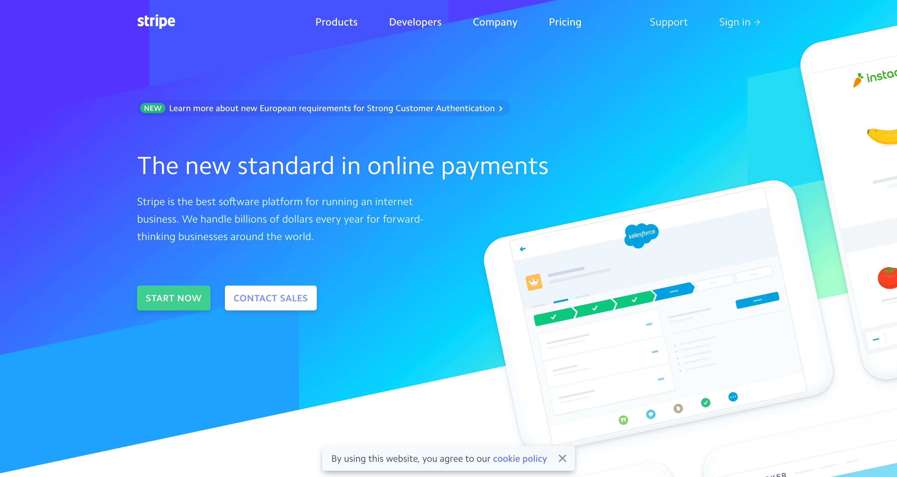
Gradients and duotones
While gradients are certainly not a new concept, they are starting to have much more of an impact. This is particularly true in the realm of logo design. Traditional colour transitions such as red into orange or blue into purple are enjoying a resurgence right now, but don’t discount weightier duotones if you want to make more of a statement.
via Stripe
Flat design with a dose of realism
It’s true that opposites can attract and in doing so can open a whole new realm of design possibilities. Flat design with a splash of realism can be quite jarring and it is this sense of chaos that brings a sort of unparalleled energy.
Update classic web design by embracing colourful minimalism
A “less is more” attitude has been at the forefront of design for at least the last five years. Largely motivated by a rise in mobile browsing on smaller screens. While minimalism doesn’t look as though it’s going anywhere anytime soon. Expect to see designs with bolder smatterings of colour this year. Look out for retro-inspired colour palettes mixed with pops of brighter hues and sleek gradients.
Whether you want to explore the possibilities of 3D design, update a classic aesthetic with splashes of bold colour or go all in and really embrace bold eccentricity, the possibilities really are endless. At Casper Creative we love designing bold websites to suit your brand. Get in touch today to discover how Casper Creative can help your business.


